Variance breakdown
A Bad Year, or a Bad Place?
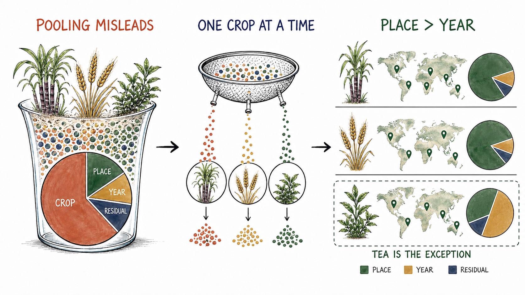
One model gave the wrong picture. Looking at each crop separately showed that place usually matters much more than year.
- Published
- August 13, 2026 · 2 min read
- Built for
- Grapevine Red Blotch Virus gene data, UC Davis
- Re-applied to
- World crop yield data, 1961-2023 (FAOSTAT)
Start with a simple question
When crop yields differ, is it mainly because of where the crop was grown or when it was grown?
This method splits the differences into four parts: crop, country, year, and everything left unexplained.
First test: mix all crops
Put every crop into one model and ask what explains the differences.
Where yield differences come from
Mixing all crops gives the wrong picture
Crop type looks most important only because crops have very different yield levels. When each crop is studied separately, country becomes the largest source of difference.
All crops together
Each crop tested separately
Evidence detail
| Test | Country | Crop | Year | Unexplained |
|---|---|---|---|---|
| All crops together | 15.9% | 73.9% | 1.3% | 8.9% |
| Each crop separately | 69.1% | not included | 5.6% | 23.9% |
Why this answer is misleading
The result says crop type explains 73.9% of the difference. But this is not very useful.
Sugarcane and wheat have very different yield levels. Mixing them mostly confirms that sugarcane is not wheat.
Better test: study each crop separately
Now ask the same question one crop at a time: does place or year matter more?
One crop at a time
For most crops, place explains far more than year
Tea is the main exception. Its yields rose steadily over 63 years, so year matters more than country.
CountryYear. The number on the right is the year share.
Evidence detail
| Crop | Country share | Year share | Unexplained | Countries |
|---|---|---|---|---|
| Tea leaves | 25.7% | 57.9% | 16.4% | 46 |
| Soya beans | 63.1% | 15.0% | 21.9% | 43 |
| Wheat | 69.6% | 14.1% | 16.3% | 84 |
| Maize (corn) | 69.1% | 12.3% | 18.6% | 126 |
| Potatoes | 70.8% | 11.9% | 17.3% | 110 |
| Rice | 71.6% | 8.8% | 19.5% | 98 |
| Barley | 77.3% | 8.3% | 14.5% | 67 |
| Sorghum | 80.0% | 3.0% | 16.9% | 74 |
| Taro | 85.6% | 0.8% | 13.6% | 39 |
Across 63 crops, country explains a typical 69.1% of the difference. Year explains only 5.6%. Place matters about twelve times more.
Tea is different. Year explains 57.9% because tea yields rose steadily in many countries.
When this is useful
Use this method when a result has several possible sources and you need to know where to look next:
- Country is largest: check farming methods, climate, irrigation, and local policy.
- Year is largest: check weather, new crop varieties, and changing technology.
- The unexplained part is largest: an important factor may be missing from the data.
What this test cannot tell us
Year does not mean weather alone. It also includes long-term changes such as better crop varieties and farming inputs.
The dataset includes only countries and crops with records for every year from 1961 to 2023. This makes comparison easier, but leaves out incomplete records.
This test does not prove cause. “Country” combines soil, climate, irrigation, crop varieties, and policy. The result shows where differences appear, not exactly what caused them.
How this was done
Every figure and number on this page is produced by the linked code.
- Original work
- GRBV analysis code (study in progress)
- Reproducible code
- View analysis code